Controls
The WebPage Controls are used to insert interactive HMI elements.
All of the Controls elements have these Event handler script points (a few Controls elements have additional Event handler script points, which are indicated in their description):
- On Mouse Enter
- On Mouse Leave
- On Mouse Move
For more information about the Event handler script points, see the topic WebPage Elements Event Handler Scripts.
| Element | Description |
|---|---|
| Button |
The Button element is used for such actions as jumping to another WebPage, causing a Task to run, interacting with region graphics, or a Button function. The Button Properties include the Click Command property, which provides a pre-defined list of available actions to which to bind the press of the Button. Note: For more information, see the topic Button Click Command Property.
The Button element has one additional Event handler script point:
Note: The On Clicked script point will execute every time a user presses the Button. If both the Click Command and On Clicked script point are set, the Click Command has precedence, and will execute before the On Clicked script.
|
| CheckBox |
The CheckBox element contains an interactive checkbox and a label beside the checkbox. To configure the appearance and placement of the label, use the Properties in the Text section (the Text Padding property determines the amount of spacing between the checkbox and the text). The CheckBox element also has three additional Event handler script points:
|
| DataTable |
The DataTable element provides a read-only table for displaying tabular data. The Content property can be set to a DataSet Data Type tag, allowing tabular data to be displayed during deployed mode. The DataTable element has three additional Event handler script points:
|
| DateTime Entry |
The DateTime Entry element provides a means to show and/or enter a date and/or time via the HMI. The DateTime Entry element has one additional Event handler script point:
|
| FormattedLabel |
The FormattedLabel element is used to add text to your project. While in Program Mode, the FormattedLabel element provides an HTML5 text editor to format the text in the element. Simply double-click the element and begin adding text (you can either type and format directly in the element, or copy and paste the content from another word processing application). This element can be used to add instructions or details about your project. The Text property can be bound to a tag, which can then be updated based on another part of the project, such as a User Script. While in deployed mode, the FormattedLabel element is read-only. Note:
|
| Image | Inserts a display for a static image, such as a logo or graphic, which is added through the Resources option. Set the Source property to the Resource. |
| Label |
Inserts a control for displaying text. The Label element also has two additional Event handler script points:
|
| ListBox |
Inserts a control for displaying and interacting with a table of data. The ListBox element also has three additional Event handler script points:
|
| MultilineTextBox |
Inserts a control for entering multiple lines of text. The Text property can be bound to a tag, which can then be updated based on another part of the project, such as a User Script. The MultilineTextBox element has three additional Event handler script points:
Note: The Multiline TextBox element does not support the input of a password during deployed mode. You must use a TextBox for that capability.
|
| MultiStatus |
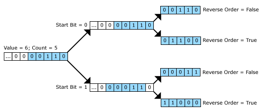
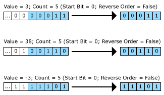
Inserts a control for graphically displaying the status of an Integer value of another WebPage Controls element, or an Integer Tag in the project, that is bound to the element's Value property. This element can be used to represent a binary representation of an Integer value, a history of results or the states of the Precision I/O lines in a project. The MultiStatus element has three additional Event handler script points:
The MultiStatus control's numbering is zero-based, and you can define the first bit to be displayed by setting the Start Bit (default is 0). The control determines the order of the displayed bits by first applying the Start Bit property, and then the value of the Reverse Order property.
The following illustration indicates how the control's settings can be used to display different bit values:
|
| Numeric Entry |
Inserts a control for entering numeric values; the values can be entered directly, or use the up and/or down arrows. The NumericEntry element also has an additional Event handler script point:
|
| Panel |
Inserts a panel that can be used to place other HMI elements on top of, which can be used to help visually organize elements and act as a container for multiple elements. Note:
|
| ProgressBar |
Inserts a control to display the progress of a process, by selecting a user-defined Minimum and Maximum (starting and end points) properties, and the Value property to monitor. These properties can either be bound to tags or hard-coded. The progress of the value is determined based on the ratio of the Value property to the Minimum and Maximum properties (starting and end points). Note: The ProgressBar element does not have any Event handler script points.
|
| RadioButton |
Inserts an interactive two-state button that can be either checked or unchecked, and a label beside the button. To configure the appearance and placement of the label, use the Properties in the Text section (the Text Padding property determines the amount of spacing between the button and the text). The RadioButton element also has three additional Event handler script points:
|
| SelectionBox |
Inserts a drop-down list control. The SelectionBox element also has three additional Event handler script points:
|
| Slider |
Inserts an interactive numerical value selector control, which allows users to graphically select a numerical value by sliding a control to the desired value. The Slider element has one additional Event handler script point:
|
| Status |
Inserts a control to graphically display the status of an integer value in the project, by binding the Value property to either a Tag or another value in the project. In addition, text, colors and icons can be added to help define the status being displayed. When monitoring the Value:
The Status element has three additional Event handler script points:
|
| TextBox |
Inserts a control for entering text. The Text property can be bound to a tag, which can then be updated based on another part of the project, such as a User Script. The Password property can be enabled to transform the TextBox into a password entry TextBox, where the characters will be replaced with asterisks. The TextBox element has three additional Event handler script points:
|